That was a long blog which essentially would have been pretty common knowledge for most Joy Division fans and/or people interested in astrophysics. And because of that I think the author missed out on raising a bigger and more interesting discussion: (I'll quote one of the comments on his site as that phrases is things rather well)
Interesting, but the article misses the point in all kinds of ways. It was common knowledge (at least, to those familiar with Joy Division and Saville's work) that the image itself was appropriated from an original that was in the public domain. The interesting point here is not copyright, but the way in which an image can come to represent a concept such that it gains new meaning. When the intended audience sees this, they think, "Joy Division", not "pulsar". Hence, when you copy the image by way of Saville, you are appropriating the association that he has established. So, this isn't about stealing images, it's about riding on the coat-tails of a talented designer who managed to create a strong brand.
A proper understanding of what's going on here makes this sentiment: "If you ever want to use the image for your own personal benefit, just make sure it’s clear you have no connection with Joy Division, Peter Saville, etc…" pretty shiesty.
The top Google links didn't mention Shakespeare's Shylock, which I always understood to be the origin. It turns out there is some disagreement between this origin and a German word.
I was stumped on that term myself, but it certainly doesn't sound endearing. It felt dishonest to rip the last line from the passage though - as if I was trying to misquote him. So I left his comment in it's entirety.
I can't really contribute anything to the discussion about the image and rights associated with it, but since I have to say I probably never would have guessed that one of my favorite bands ever would show up on HN, I guess I'm going to comment anyway. :)
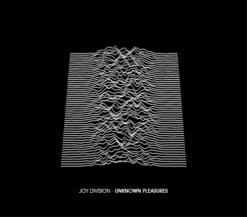
This was probably the first album that made me consider album art as real works of art. I still love Joy Division's music today and I will never forget this album cover and what I thought when I bought the album (I was a little late to discover Joy Division while Ian Curtis was alive, having discovered them through New Order around 1983 or so). Being interested in Astrophysics (as a lay person) and I believe I read that the band referred to this as "the death of a star" at the time. Love the imagery associated with that.
Great album, great cover art, and great band, I really wish Ian Curtis could have graced us with more from his fantastic mind, I don't think I've ever experienced so much fantastic imagery from any other lyricist.
EDIT: Oh, I forgot, the original CD insert that had this image on it wasn't simple paper as I recall, it was a sort of rough paper (don't know how else to describe it) with the image on it and you could feel the bumps of the lines.
I think it was that, more than even the image by itself, the two together, which really fascinated me. I wish I would have kept that edition of the CD, it was an expensive import at the time and quite original, but I went through a few CD purges back in the 90's and that was a casualty of one of them. :( Oh well. I really wish I would have gotten the vinyl and kept that, but CD's were all the rage back then.
The original sleeve for New Order's Blue Monday was a die-cut sleeve that looked like a large floppy disc. It's routinely told that the sleeve cost more to produce than the entire disc was worth. Factory Records lost money on each copy sold.
Saville also designed Tony Wilson's headstone, which is pretty freaking cool (even though it took a few years to get done)
I haven't seen that before so thanks for linking! I've been a huge fan of Saville's work for years now, and a bit of a collector of his work. I have a couple of the special boxed Factory Records tapes from the earlier Factory years, including Unknown Pleasures.
I'm also glad to see the tombstone is using the Factory Records typeface (at least up top). I wonder if it has a FAC catalog number...
Factory Records put a lot into design and the concept behind it. Durutti Column's "Return of Durutti Column" sleeve was made of sandpaper, so it could damage other records placed beside it (the idea was supposedly Tony Wilson's).
Popular Science in 1973 had an interesting article¹ on cutting-edge computer visualization, including a star-data image similar in style to the Joy Division image, except in perspective and with different data. The article describes new technology that allowed "fantastic" visualization with 7 colors.
The Joy Division style 3-D surface plots were a pretty standard computer graphics thing in the 1970s, often with lines in the Y direction too making a grid. They had the advantage of being pretty easy to program and not requiring a lot of memory - just start drawing lines at the front and keep track of the highest point at each X position. A function such as a damped sinusoid makes a nice image this way.
Apparently it was done with some sort of oscillograph.
So how come the peaks hide the drawings behind it?
Ok, thinking about this, if the drawing is done all at the same time, (like a signal FFT from the 60's) then the lower drawing device hits the upper drawing device (if the signal is bigger) hence making both trace the same thing.
The image dates from 1971. I am going to guess it was simply drawn on a plotter, using a hidden-line removal algorithm. The same could have been done on a vector monitor, but it seems the image has the wrong dimensions for that.
Actually you're both wrong. The image is from the late 60s and isn't one single plotted graph but actually multiple different measurements that have then been stacked to make comparison easier.
This article does actually explain this, but I can forgive you for not getting that far as it's the very last item on his blog and appears only to have been mentioned as an after thought.
Okay, so it was probably created in 1969 or 1970 and only published in 1971.
I think you've misunderstood what we are talking about - the method by which the graphic was created. Which I assume to have been a plotter fed instructions by a program that removed hidden lines from the graphs.
   EIGHTY SUCCESSIVE PERIODS of the first pulsar observed,
   CP1919 (Cambridge pulsar at 19 hours 19 minutes right
   ascension), are stacked on top of one another using the
   average period of 1.33730 seconds in this computer-generated
   illustration produced at the Arecibo Radio Observatory in
   Puerto Rico.
The blog post was written on 19th May 2011, so I guess that the T-Shirt was either produced already, or that the whole project has been shelved.
His last update to his post is from December 2012, and there is no mention about an actual T-Shirt that was produced.
I would have also like to see the design of the T-Shirt, but I guess I never will.
I was in MOMA in Glasgow a few years ago - back when it used to have cool stuff - and there was an installation in the basement, part of which was a running turntable with the needle stuck in the locked groove at the end. The record was - of course - Unknown Pleasures, and in a pleasing symmetry I was wearing my T-Shirt with the pulsar image on it.
It seems that the options for getting artistic content for your products (websites/books/games/album covers) these days are limited. Either you go get something off istock photo, or your rip from google images hoping that the original owner doesn't notice.
Wouldn't it be nice to have a marketplace for art? Or some sort of protocol for tracking down who created what?
The business model for the company would be that of intermediary -- i find who the copyright belongs to and skim a keep a percentage of the royalty.
Better art and no fear of copyright infringement for clients + better paid artists = win win.
That pulsar has been my desktop background for a few years now. Brutally honest, cathartic album and one of the first ones where I 'identified with' the music and the art.
I once wrote a program in BASIC (on my C64) which would make such a display (it's straightforward). I lost that program, but recreated a lookalike in Python:
    import random
    import math

    canvh = 40
    canvw = 60
    tracecount = 16
    canvas = [[' ' for col in xrange(canvw)] for row in xrange(canvh)]

    def randomtrace():
        sigma = random.uniform(4, 20)
        mu = random.gauss(canvw/2, canvw/20)
        k = canvw / (sigma * math.sqrt(2*math.pi))
        s = -1.0 / (2 * sigma * sigma)
        amp = 2.0
        tr = [amp * k * math.exp(s * (x - mu)*(x - mu)) for x in xrange(canvw)]
        # TODO: Random permutations, or Perlin noise.
        return tr

    for t in range(tracecount):
        if t == 0 or t == tracecount - 1:
            continue
        y = t * canvh / tracecount
        trace = randomtrace()
        for x, t in enumerate(trace):
            t = int(t)
            top = y - t
            if top >= 0:
                canvas[top][x] = '-'
            for i in range(t):
                top += 1
                if top >= 0:
                    canvas[top][x] = ' '

    for row in canvas:
        line = "".join(row)
        print "  ", line
Whoah, that's a nice one. I wonder whether the original Arecibo data-set of the pulsar is still around somewhere. I tried to find it, but I didn't succeed.
This whole article reads like it's written by someone who has never been inside a library. "it would be nice to have an original copy of those 3 aforementioned works in front of me to see if they list any copyright". If only there were institutions that have copies of obscure works like "Scientific American" that allowed people to peruse them for free.
I remember when the album came out I immediately recognized the image, but I had no idea they had lifted it directly from the book itself. Now I wish I hadn't cut the picture out and taped it to the wall. :)
Not a joke, but my first language isn't English so I'll own up to the poorly written part. I think I was trying to point out that it seems he copied the actual photographs of the magazines from somewhere because he admits to not owning them.
Interesting, but the article misses the point in all kinds of ways. It was common knowledge (at least, to those familiar with Joy Division and Saville's work) that the image itself was appropriated from an original that was in the public domain. The interesting point here is not copyright, but the way in which an image can come to represent a concept such that it gains new meaning. When the intended audience sees this, they think, "Joy Division", not "pulsar". Hence, when you copy the image by way of Saville, you are appropriating the association that he has established. So, this isn't about stealing images, it's about riding on the coat-tails of a talented designer who managed to create a strong brand.
A proper understanding of what's going on here makes this sentiment: "If you ever want to use the image for your own personal benefit, just make sure it’s clear you have no connection with Joy Division, Peter Saville, etc…" pretty shiesty.